Thursday 12 January 2012

The Eventscape Project: My Favourite Model

Hello everybody,

   Back in November we did a project with Lakeshore Arts and a company called Eventscape where we had to design a sculpture that would go near the front of the school. For the first couple of days we brainstormed where the sculpture would go, what message we wanted to convey with it, things like that. Then we took a field trip to Eventscape's metal building <where they make all their metal sculptures. By far that was the best part of the entire project, in my opinion. After that, we kept brainstorming and building rough model after rough model until we had a final design.


   My favourite design was a bench I made with some friends when we were doing a group building session (We all were just making whatever we though would look cool and my design happened to turn out well). It is a curvy bench and the back of it rises up and down like a wave. The wave design was something I thought looked neat and the fact that our community is next to a lake worked perfectly. The thing I was going for most was comfort. I hate it when I sit on a bench that looks awesome and find out it is uncomfortable. I was building it definitely with regular bench-sitters in mind. The bench was made with pipe cleaners, tape, cardboard and foam core. I like this model the most since it is something that I would definitely want to sit on if it was actually built. I like the interesting design, and the fact that it has a back so you could lean back on it if you wanted to(most of the bench models built did not have something you could lean back on). If I was to improve this model, I think some of the things I would do would be to make the poles on the back of the bench flatter and thicker. That way, it would be more comfortable for people to lean against <I have had bad experiences with round, uncomfortable backs on benches>.

Sunday 8 January 2012

Your Choice Assignment: Trading Cards

Hello everybody,

I apologize for neglecting this blog up until now, but one of my New Year's Resolutions is to update it regularly and put up more posts! This assignment was to choose either creating four artist trading cards, or do a non-objective piece of art <both of these assignments have to be done with silhouettes and must convey a strong message about an important issue in society>. I chose to create the artist trading cards and convey a message about endangered species<For all those who think these look like Pokemon or Yugioh cards, you are mistaken. Artist trading cards are miniature interpretations of a famous artist's work>.

   The idea behind the trading cards I created was that more and more species are becoming endangered, but this issue is not prevalent in many peoples' lives. The works of art that I chose (Lady With an Ermine by Leonardo da Vinci, Whistler's Mother by James Whistler, The Blue Boy by Thomas Gainsborough, and Girl With a Pearl Earring by Johannes Vermeer) are all very famous; I decided to turn the humans in each work into endangered animals. Whistler's Mother became Whistler's Great White Shark, Lady with an Ermine became Black-footed Ferret with a Lady, The Blue Boy became The Blue Markhor, and Girl with a Pearl Earring became Hawaiian Crow with a Pearl Earring. In doing this, I felt the importance of endangered animals would increase the strangeness of the trading cards would create a lasting impression in viewers' minds. Not only that, but the composition is recognizable since the only thing different from the original paintings is the fact that the subjects are all animals.

    In order to complete this assignment, I had to screen print my designs onto pieces of thick paper without the works ending up unprofessional. The hardest part of this assignment was the screen printing; making sure there were no smudges or there was enough ink. Sometimes I had too much ink, and that would cause the ink to bleed in some areas. Another tricky part was cutting out the template to place on the silk screen. I had to make sure everything was connected to the rest of the paper or else it would just fall out. Also, I had to get rid of a lot of details that were in the paintings because otherwise screen printing would not be possible. Pieces would have ripped or stuck together. I had never screen printing before but it was quite interesting to learn and use. If done properly, it is useful when making multiple copies of something.

   One thing I really liked about the finished product was the crisp edges and the spookiness of the trading cards. The fact that they all had to be silhouetted means that the animals dressed in clothes are at first glance eerie <and sometimes unrecognizable>. Because of the fact that they are silhouettes, the animals are a bit tricky to recognize <I do not mind this because it makes the viewer think about the artwork and wonder what the message behind it is>. All in all, I am happy how it turned out.

Friday 7 October 2011

Death Eaters and Tacos

Greetings readers,

Here's some photoshop awesomeness. All of these images were edited by me. Copyright to the owners of the characters and myself. If you wanna use these photos for something, let me know please. Viewer discretion is advised....
This is Buster Baxter from Arthur...

It's Taco night.

Oh no! Ron's gonna get creamed...

Birthday card for a friend of mine.. she really liked it.

Mr. Ratburn from Arthur.

Muffy Crosswire from Arthur.
It's bathtime at hogwarts!!!

More bathtub! Can you spot the duck?


Oh no! Harry's hungry!

Draco's new best friend.

Lucius is ready to catch 'em all!!! Team Rocket has just gotten twice as awesome.
Wizards can party waaay better than Muggles. Methinks Neville and Snape are becoming fast friends.

Tuesday 4 October 2011

CyberArts Duality Paintings

   Hello, everybody,

 This is a post about the latest assignment we completed in CyberArts. The mission was to create a work of art that conveys two aspects of your personality using whichever medium you desire. The concept could be simple or could be very deep and personal. For my medium I decided to use watercolour. Coming up with the concept was a little bit tricky since there are so many different aspects to my personality. My final decision was to show my creative side and my serious side. The creative side is covered with weird blue shapes and the serious side is my regular face. I wanted to go with something a bit more abstract for the shadows on my face since that's not something I normally do; I thought it'd be best to be creative for my creative side <har har>. For the background, I wanted something simple and went for a primary colours theme. The background is lighter on the shadowed side of my face because I wanted it to stand out; that's also why I made the background darker on the lighter side of my face. I like this piece; it was interesting painting the shapes on my shadowed face. The things I would change are the shadow for my right eye (it looks really weird) and fix up the hair a bit more.

Monday 26 September 2011

New-ish Drawings

Here are some more under-the-bed drawings that I completed after I entered high school. The newest ones will be at the top of the post. Enjoy!
First sketchbook of Grade 12 CyberArts! 8D

Weird drawing I did over the summer.

Another weird drawing, this time in colour with a biiiig stick.

Scary drawing over the summer. O.O

Eek.

Yawn.

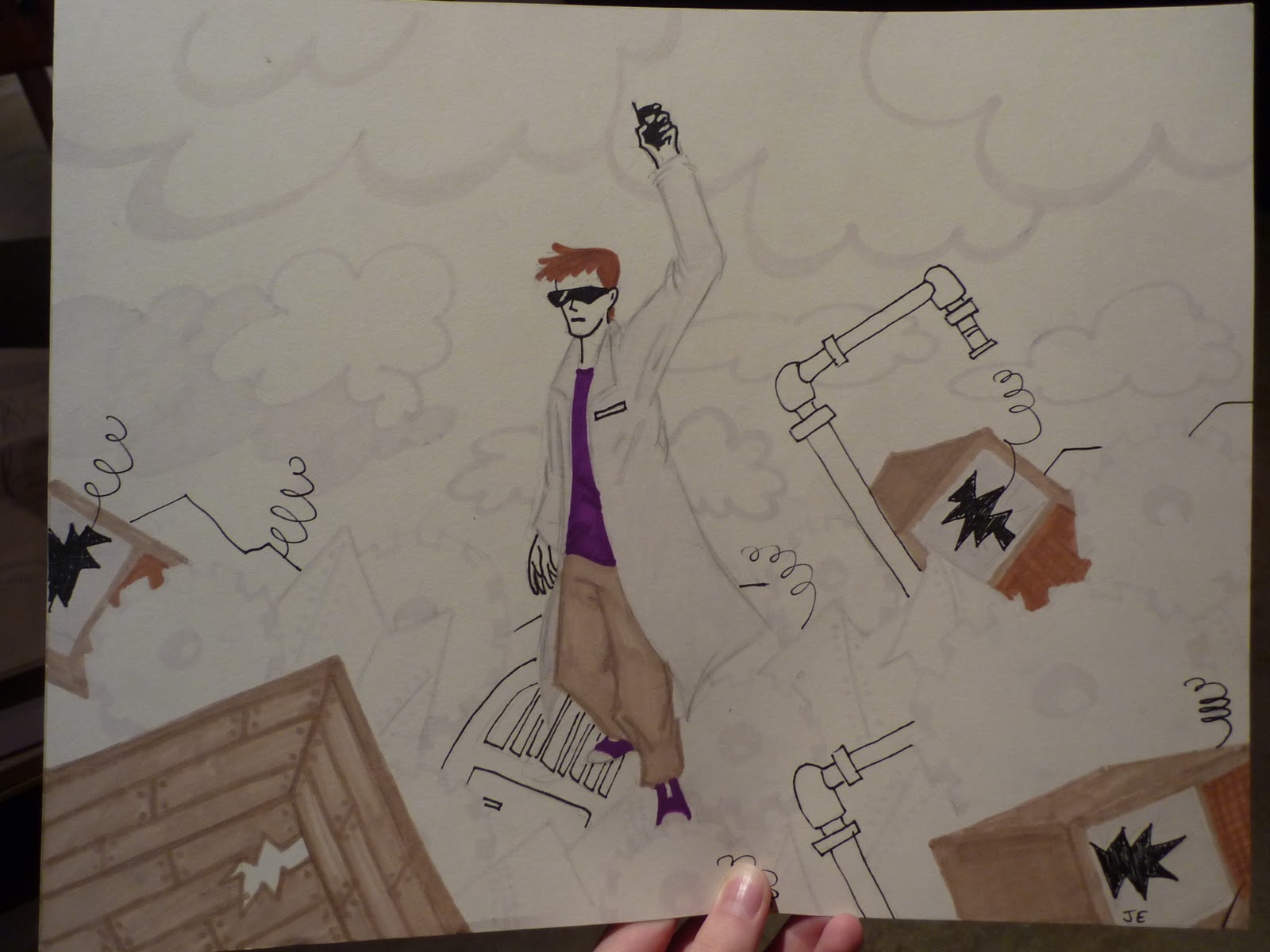
I'm not sure what this is. I think I saw someone who looked like this once. Done in the summer before G 12.

This was part of a series of Harry Potter drawings where various characters would glomp each other (I don't know). This was done in the summer as well.  This one's Lucius Malfoy. 

This one's Severus Snape glomping Voldemort.

Poor Voldy! Harry Potter wants to glomp him too.

Heh. No glomp for Dumbledore hobo-ghost. Harry knows what's going down.

Draco Malfoy can't resist a Potter-Glomp. It could be Ron Weasley (he doesn't have freckles so I'm not sure).


My uncle and I came up with this idea. I guarantee it would be waaaay better than Lord of the Rings: The Musical or the epic fail Spiderman: The Musical.

Grade 11 CyberArts assignment. The idea was to show objects that convey your personality (carrot is goofy side, hat is sophisticated, blah blah blah). I really like how this turned out. Gotta thank my dad for his great tips.

CyberArts quickie still life (Grade 11); chose to draw a Cars figurine. I think it turned out not bad.

Life drawing in CyberArts (Grade 11). Meh.

Random doodles in Grade 11. 

More random doodles (G 11)

Ditto.

Same thing. 

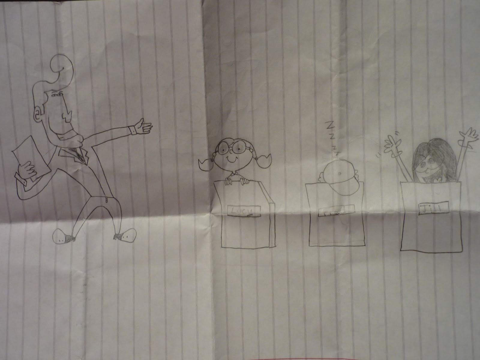
Doodled this on the back of an incredibly boring media studies chart (G 11). Which one's your favourite?

Doodled on scrap paper from art. (G 11)

Ditto.

CyberArts (G 11) sketchbook assignment. 

Random marker thing (G 11). I tried some other birds but they turned out crap. 

G 11 CyberArts sketchbook assignment. Me as Cammy from Street Fighter. 

I did this in Grade 10 for history class. The assignment was a propaganda poster.

This was a Grade 10 CyberArts assignment. I forget what it was but I remember it had to be deep-meaning and we had a limited amount of time in one class to do it. 

I think I did this in Grade 10. CyberArts assignment still life. 

I think I did this sometime in Grade 9 when I was into the graffiti style of drawing.

This was done in Grade 9, I'm sure of it. It's some weird collection of my favourite anime characters at the time, with some graffiti-style elements added. 


Thursday 22 September 2011

Old Drawings

   I was cleaning out my room and found a bunch of these drawings underneath my bed. After meticulously pulling off all the dust bunnies, I decided to upload most of them onto this here blog! Starting with the old old ones, I'll post another post of more recent works. Enjoy!


This was the winning logo for our school play Joseph and the Technicolour DreamCoat in Grade 7. XD

I'm not sure when this was done. Some kind of bomber frog. 
I don't know when this was done either. Looks cheery though. 


Words cannot express this period where I was obsessed with drawing weird elf-things with ears and tails. Some of them don't even look remotely human (bat guy and weird winged-thing?) Don't know when this happened but I'd estimate probably grade 7 or 8. 

This was an "excercise" on drawing animals from some book. I'd estimate grade 6 for this one. <hangs head in shame at elephant's pot belly>


These are doodles from I don't know when.


This is a really lame Harry Potter comic from probably Grade 7 or 8. I think my brother drew the weird bird-ghost thing <vandal!>.  Let's just pretend it's Fawkes the phoenix... From what I gathered from it, looks like Snape won't get a promotion unless he's nice to Harry; the strain of being nice causes him to lose his marbles. 

I don't know when this one was done. Looks like some weird child game show. 

Prince and the Pauper assignment for Grade 8. My teacher was kind enough to laminate it <cuz he wanted to keep it>. He ended up keeping the photocopies that he tried to give me. 


I thing this was for some weird Neopets contest that I never heard back from. I copied the pose from some art book; I don't know when I did this one. 

I did this between Grade 8 and Grade 9; one of the pieces I used in  my portfolio for entering CyberArts.

This is all the artwork that I found under my bed that I know I did sometime before I entered high school. I know lots of it isn't that great but I wanted to post it anyway XD